August 30, 2018
Who Rules America ?: Wealth, Income, and Power, by G. William Domhoff
Who Rules America ?: Wealth, Income, and Power, by G. William Domhoff
Domhoff has written six updates to Who Rules America?; every edition has been used as a sociology textbook. In 2017, he contributed to Studying the Power Elite: Fifty Years of Who Rules America, a collection of essays and critiques.
This document's URL: http://whorulesamerica.net/power/wealth.html
This document presents details on the wealth and income distributions in the United States, and explains how we use these two distributions as power indicators. The most striking numbers on income inequality will come last, showing the dramatic change in the ratio of the average CEO's paycheck to that of the average factory worker over the past 40 years.
First, though, some definitions. Generally speaking, wealth is the value of everything a person or family owns, minus any debts. However, for purposes of studying the wealth distribution, economists define wealth in terms of marketable assets, such as real estate, stocks, and bonds, leaving aside consumer durables like cars and household items because they are not as readily converted into cash and are more valuable to their owners for use purposes than they are for resale (see Wolff, 2004, p. 4, for a full discussion of these issues). Once the value of all marketable assets is determined, then all debts, such as home mortgages and credit card debts, are subtracted, which yields a person's net worth. In addition, economists use the concept of financial wealth -- also referred to in this document as "non-home wealth" -- which is defined as net worth minus net equity in owner-occupied housing. As Wolff (2004, p. 5) explains, "Financial wealth is a more 'liquid' concept than marketable wealth, since one's home is difficult to convert into cash in the short term. It thus reflects the resources that may be immediately available for consumption or various forms of investments."
We also need to distinguish wealth from income. Income is what people earn from work, but also from dividends, interest, and any rents or royalties that are paid to them on properties they own. In theory, those who own a great deal of wealth may or may not have high incomes, depending on the returns they receive from their wealth, but in reality those at the very top of the wealth distribution usually have the most income. (But it's important to note that for the rich, most of that income does not come from "working": in 2008, only 19% of the income reported by the 13,480 individuals or families making over $10 million came from wages and salaries. See Norris, 2010, for more details.)
This document focuses on the "Top 1%" as a whole because that's been the traditional cut-off point for "the top" in academic studies, and because it's easy for us to keep in mind that we are talking about one in a hundred. But it is also important to realize that the lower half of that top 1% has far less than those in the top half; in fact, both wealth and income are super-concentrated in the top 0.1%, which is just one in a thousand. (To get an idea of the differences, take a look at an insider account by a long-time investment manager who works for the well-to-do and very rich. It nicely explains what the different levels have -- and how they got it. Also, David Cay Johnston (2011) has written a column about the differences among the top 1%, based on 2009 IRS information.)
As you read through the facts and figures that follow, please keep in mind that they are usually two or three years out of date because it takes time for one set of experts to collect the basic information and make sure it is accurate, and then still more time for another set of experts to analyze it and write their reports. It's also the case that the infamous housing bubble of the first eight years of the 21st century inflated some of the wealth numbers.
There's also some general information available on median income and percentage of people below the poverty line in 2010. As might be expected, most of the new information shows declines; in fact, a report from the Center for Economic and Policy Research (2011) concludes that the decade from 2000 to 2010 was a "lost decade" for most Americans.
One final general point before turning to the specifics. People who have looked at this document in the past often asked whether progressive taxation reduces some of the income inequality that exists before taxes are paid. The answer: not by much, if we count all of the taxes that people pay, from sales taxes to property taxes to payroll taxes (in other words, not just income taxes). And the top 1% of income earners actually pay a smaller percentage of their incomes to taxes than the 9% just below them. These findings are discussed in detail near the end of this document.
Exactly how rich are the Top 1%?
People often wonder exactly how much income and/or wealth someone needs to have to be included in the Top 1% or the Top 20%; Table 1 below lists some absolute dollar amounts associated with various income and wealth classes in 2013, but the important point to keep in mind is that for the most part, it's the relative positions of wealth holders and income earners that we are trying to comprehend in this document.
Table 1: Income and net worth in the U.S. by class, 2013
| Wealth or | Mean household income | Mean household |
|---|---|---|
| Top 1 percent | $1,679,000 | $18,623,400 |
| Top 20 percent | $257,200 | $2,260,300 |
| 60th-80th percentile | $76,500 | $236,400 |
| 40th-60th percentile | $46,000 | $68,100 |
| Bottom 40 percent | $20,300 | -$10,800 |
From Wolff (2014); only mean figures are available, not medians. Note that income and wealth are separate measures; so, for example, the top 1% of income-earners is not exactly the same group of people as the top 1% of wealth-holders, although there is considerable overlap.
The Wealth Distribution
In the United States, wealth is highly concentrated in relatively few hands. As of 2013, the top 1% of households (the upper class) owned 36.7% of all privately held wealth, and the next 19% (the managerial, professional, and small business stratum) had 52.2%, which means that just 20% of the people owned a remarkable 89%, leaving only 11% of the wealth for the bottom 80% (wage and salary workers). In terms of financial wealth (total net worth minus the value of one's home), the top 1% of households had an even greater share: 42.8%. Table 2 and Figure 1 present further details, drawn from the careful work of economist Edward N. Wolff at New York University (2017).
Table 2: Distribution of net worth and financial wealth in the United States, 1983-2013
| Total Net Worth | |||
|---|---|---|---|
| Top 1 percent | Next 19 percent | Bottom 80 percent | |
| 1983 | 33.8% | 47.5% | 18.7% |
| 1989 | 37.4% | 46.2% | 16.5% |
| 1992 | 37.2% | 46.6% | 16.2% |
| 1995 | 38.5% | 45.4% | 16.1% |
| 1998 | 38.1% | 45.3% | 16.6% |
| 2001 | 33.4% | 51.0% | 15.6% |
| 2004 | 34.3% | 50.3% | 15.3% |
| 2007 | 34.6% | 50.5% | 15.0% |
| 2010 | 35.1% | 53.5% | 11.4% |
| 2013 | 36.7% | 52.2% | 11.1% |
| Financial (Non-Home) Wealth | |||
|---|---|---|---|
| Top 1 percent | Next 19 percent | Bottom 80 percent | |
| 1983 | 42.9% | 48.4% | 8.7% |
| 1989 | 46.9% | 46.5% | 6.6% |
| 1992 | 45.6% | 46.7% | 7.7% |
| 1995 | 47.2% | 45.9% | 7.0% |
| 1998 | 47.3% | 43.6% | 9.1% |
| 2001 | 39.7% | 51.5% | 8.7% |
| 2004 | 42.2% | 50.3% | 7.5% |
| 2007 | 42.7% | 50.3% | 7.0% |
| 2010 | 41.3% | 53.5% | 5.2% |
| 2013 | 42.8% | 51.9% | 5.3% |
Total assets are defined as the sum of: (1) the gross value of owner-occupied housing; (2) other real estate owned by the household; (3) cash and demand deposits; (4) time and savings deposits, certificates of deposit, and money market accounts; (5) government bonds, corporate bonds, foreign bonds, and other financial securities; (6) the cash surrender value of life insurance plans; (7) the cash surrender value of pension plans, including IRAs, Keogh, and 401(k) plans; (8) corporate stock and mutual funds; (9) net equity in unincorporated businesses; and (10) equity in trust funds. Total liabilities are the sum of: (1) mortgage debt; (2) consumer debt, including auto loans; and (3) other debt. From Wolff (2017).
Figure 1: Net worth and financial wealth distribution in the U.S.
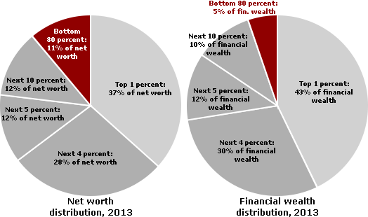
From Wolff (2017).
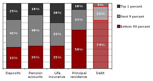
In terms of types of financial wealth, in 2013 the top one percent of households had 49.8% of all privately held stock, 54.7% of financial securities, and 62.8% of business equity. The top ten percent had 84% to 94% of stocks, bonds, trust funds, and business equity, and almost 80% of non-home real estate. Since financial wealth is what counts as far as the control of income-producing assets, we can say that just 10% of the people own the United States of America; see Table 3 and Figure 2 for the details. The only category which is not skewed severely toward the upper class is debt.
Table 3: Wealth distribution by type of asset, 2013
| Investment Assets | |||
|---|---|---|---|
| Top 1 percent | Next 9 percent | Bottom 90 percent | |
| Business equity | 62.8% | 31.0% | 6.2% |
| Financial securities | 54.7% | 39.6% | 5.7% |
| Stocks and mutual funds | 49.8% | 41.2% | 9.1% |
| Trusts | 49.5% | 34.0% | 16.5% |
| Non-home real estate | 33.7% | 44.1% | 22.2% |
| TOTAL investment assets | 51.5% | 37.0% | 11.5% |
| Housing, Liquid Assets, Pension Assets, and Debt | |||
| Top 1 percent | Next 9 percent | Bottom 90 percent | |
| Principal residence | 9.8% | 31.1% | 59.2% |
| Deposits | 24.8% | 42.4% | 32.8% |
| Life insurance | 30.0% | 35.3% | 34.7% |
| Pension accounts | 17.8% | 47.5% | 34.8% |
| TOTAL other assets | 14.5% | 37.6% | 47.9% |
| Debt | 5.4% | 21.1% | 73.5% |
From Wolff (2014).
Figure 2a: Wealth distribution by type of asset, 2013: investment assets
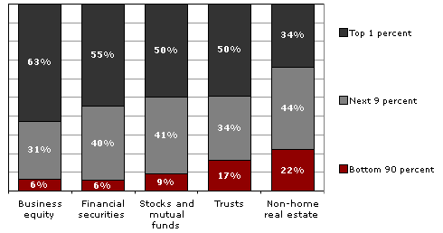
Figure 2b: Wealth distribution by type of asset, 2013: other assets
From Wolff (2014).
There is a perception that a large number of Americans own stock -- through mutual funds, trusts, pensions, or direct purchase of shares. This is true to some extent: 46% of American households have direct or indirect investments in the stock market. But the top 10% of households own 81% of the total value of those investments (Wolff, 2014); the vast majority have relatively meager holdings.
Inheritance and estate taxes
Figures on inheritance tell much the same story. According to a study published by the Federal Reserve Bank of Cleveland, only 1.6% of Americans receive $100,000 or more in inheritance. Another 1.1% receive $50,000 to $100,000. On the other hand, 91.9% receive nothing (Kotlikoff & Gokhale, 2000). Thus, the attempt by ultra-conservatives to eliminate inheritance taxes -- which they always call "death taxes" for P.R. reasons -- would take a huge bite out of government revenues (an estimated $253 billion between 2012 and 2022) for the benefit of the heirs of the mere 0.6% of Americans whose death would lead to the payment of any estate taxes whatsoever (Citizens for Tax Justice, 2010b).
It is noteworthy that some of the richest people in the country oppose this ultra-conservative initiative, suggesting that this effort is driven by anti-government ideology. In other words, few of the ultra-conservative and libertarian activists behind the effort will benefit from it in any material way. However, a study (Kenny et al., 2006) of the financial support for eliminating inheritance taxes discovered that 18 super-rich families (mostly Republican financial donors, but a few who support Democrats) provide the anti-government activists with most of the money for this effort. (For more infomation, including the names of the major donors, download the article from United For a Fair Economy's Web site.)
Actually, ultra-conservatives and their wealthy financial backers may not have to bother to eliminate what remains of inheritance taxes at the federal level. The rich already have a new way to avoid inheritance taxes forever -- for generations and generations -- thanks to bankers. After Congress passed a reform in 1986 making it impossible for a "trust" to skip a generation before paying inheritance taxes, bankers convinced legislatures in many states to eliminate their "rules against perpetuities," which means that trust funds set up in those states can exist in perpetuity, thereby allowing the trust funds to own new businesses, houses, and much else for descendants of rich people, and even to allow the beneficiaries to avoid payments to creditors when in personal debt or sued for causing accidents and injuries. About $100 billion in trust funds has flowed into those states so far. You can read the details on these "dynasty trusts" (which could be the basis for an even more solidified "American aristocracy") in a New York Times opinion piece published in July 2010 by Boston College law professor Ray Madoff, who also has a book on this and other new tricks: Immortality and the Law: The Rising Power of the American Dead (Yale University Press, 2010).
Home ownership & wealth
For the vast majority of Americans, their homes are by far the most significant wealth they possess. Figure 3 comes from the Federal Reserve Board's Survey of Consumer Finances (via Wolff, 2017) and compares the median income, total wealth (net worth, which is marketable assets minus debt), and non-home wealth (which earlier we called financial wealth) of White, Black, and Hispanic households in the U.S.
Figure 3: Income and wealth by race in the U.S.
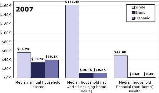
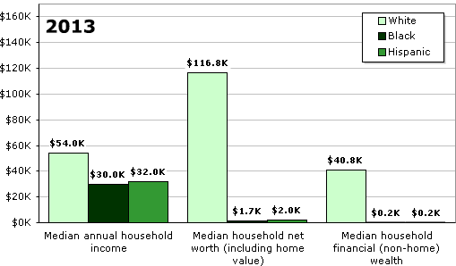
From Wolff (2017). All figures adjusted to 2013 US dollars.
Besides illustrating the significance of home ownership as a source of wealth, the graph also shows that Black and Latino households are faring significantly worse overall, whether we are talking about income or net worth. In 2013, the average white household had more than 15 times as much total wealth as the average African-American or Latino household. If we exclude home equity from the calculations and consider only financial wealth, the ratios are more than 200:1. Extrapolating from these figures, we see that 65% of white families' wealth is in the form of their principal residence; for Blacks and Hispanics, the figures are close to 90%.
And for all Americans, things got worse during the "Great Recession": comparing the 2007 numbers to the 2013 numbers, we can see a huge loss in wealth -- both housing and financial -- for most families, making the gap between the rich and the rest of America even greater, and increasing the number of households with no marketable assets from 18.6% to 21.8% (Wolff, 2012 & 2014).
Do Americans know their country's wealth distribution?
An interesting study (Norton & Ariely, 2010) reveals that Americans have no idea that the wealth distribution (defined for them in terms of "net worth") is as concentrated as it is. When shown three pie charts representing possible wealth distributions, 90% or more of the 5,522 respondents -- whatever their gender, age, income level, or party affiliation -- thought that the American wealth distribution most resembled one in which the top 20% has about 60% of the wealth. In fact, of course, the top 20% control 85% of the wealth. (Table 2 and Figure 1 in this document show the Top 20% owning 89% of the net worth, rather than 85%; the discrepancy is mostly due to Ariely & Norton's data being about 10 years older.)
Even more striking, they did not come close on the amount of wealth held by the bottom 40% of the population. It's a number I haven't even mentioned so far, and it's shocking: the lowest two quintiles hold just 0.3% of the wealth in the United States. Most people in the survey guessed the figure to be between 8% and 10%, and two dozen academic economists got it wrong too, by guessing about 2% -- seven times too high. Those surveyed did have it about right for what the 20% in the middle have; it's at the top and the bottom that they don't have any idea of what's going on.
Americans from all walks of life were also united in their vision of what the "ideal" wealth distribution would be, which may come as an even bigger surprise than their shared misinformation on the actual wealth distribution. They said that the ideal wealth distribution would be one in which the top 20% owned between 30 and 40 percent of the privately held wealth, which is a far cry from the 85 percent that the top 20% actually own. They also said that the bottom 40% -- that's 120 million Americans -- should have between 25% and 30%, not the mere 8% to 10% they thought this group had, and far above the 0.3% they actually had. In fact, there's no country in the world that has a wealth distribution close to what Americans think is ideal when it comes to fairness. So maybe Americans are much more egalitarian than most of them realize about each other, at least in principle and before the rat race begins.
Figure 4, reproduced with permission from Norton & Ariely's article in Perspectives on Psychological Science, shows the actual wealth distribution, along with the survey respondents' estimated and ideal distributions, in graphic form.
Figure 4: The actual United States wealth distribution plotted against the estimated and ideal distributions.
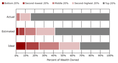
NOTE: In the "Actual" line, the bottom two quintiles are not visible because the lowest quintile owns just 0.1% of all wealth, and the second-lowest quintile owns 0.2%.
Source: Norton & Ariely (2010).
David Cay Johnston, a retired tax reporter for the New York Times, published an excellent summary of Norton & Ariely's findings (Johnston, 2010b; you can download the article from Johnston's Web site).
Historical context
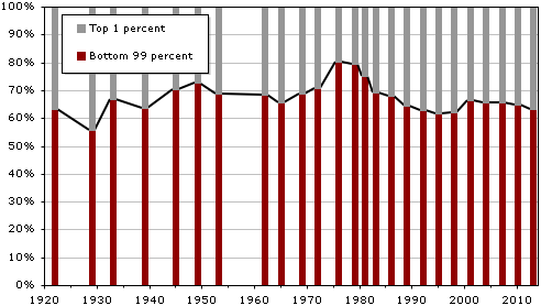
Numerous studies show that the wealth distribution has been concentrated throughout American history, with the top 1% already owning 40-50% in large port cities like Boston, New York, and Charleston in the 1800s. (But it wasn't as bad in the 18th and 19th centuries as it is now, as summarized in a 2012 article in The Atlantic.) The wealth distribution was fairly stable over the course of the 20th century, although there were small declines in the aftermath of the New Deal and World II, when most people were working and could save a little money. There were progressive income tax rates, too, which took some money from the rich to help with government services.
Then there was a further decline, or flattening, in the 1970s, but this time in good part due to a fall in stock prices, meaning that the rich lost some of the value in their stocks. By the late 1980s, however, the wealth distribution was almost as concentrated as it had been in 1929, when the top 1% had 44.2% of all wealth. It has continued to edge up since that time, with a slight decline from 1998 to 2001, before the economy crashed in the late 2000s and little people got pushed down again. Table 4 and Figure 5 present the details from 1922 through 2010.
Table 4: Share of wealth held by the Bottom 99% and Top 1% in the United States, 1922-2013.
| Bottom 99 percent | Top 1 percent | |
|---|---|---|
| 1922 | 63.3% | 36.7% |
| 1929 | 55.8% | 44.2% |
| 1933 | 66.7% | 33.3% |
| 1939 | 63.6% | 36.4% |
| 1945 | 70.2% | 29.8% |
| 1949 | 72.9% | 27.1% |
| 1953 | 68.8% | 31.2% |
| 1962 | 68.2% | 31.8% |
| 1965 | 65.6% | 34.4% |
| 1969 | 68.9% | 31.1% |
| 1972 | 70.9% | 29.1% |
| 1976 | 80.1% | 19.9% |
| 1979 | 79.5% | 20.5% |
| 1981 | 75.2% | 24.8% |
| 1983 | 69.1% | 30.9% |
| 1986 | 68.1% | 31.9% |
| 1989 | 64.3% | 35.7% |
| 1992 | 62.8% | 37.2% |
| 1995 | 61.5% | 38.5% |
| 1998 | 61.9% | 38.1% |
| 2001 | 66.6% | 33.4% |
| 2004 | 65.7% | 34.3% |
| 2007 | 65.4% | 34.6% |
| 2010 | 64.6% | 35.4% |
| 2013 | 63.3% | 36.7% |
Sources: 1922-1989 data from Wolff (1996). 1992-2013 data from Wolff (2014).
Figure 5: Share of wealth held by the Bottom 99% and Top 1% in the United States, 1922-2013.
Here are some dramatic facts that sum up how the wealth distribution became even more concentrated between 1983 and 2004, in good part due to the tax cuts for the wealthy and the defeat of labor unions: Of all the new financial wealth created by the American economy in that 21-year-period, fully 42% of it went to the top 1%. A whopping 94% went to the top 20%, which of course means that the bottom 80% received only 6% of all the new financial wealth generated in the United States during the '80s, '90s, and early 2000s (Wolff, 2007).
The rest of the world
Thanks to a 2006 study by the World Institute for Development Economics Research -- using statistics for the year 2000 -- we now have information on the wealth distribution for the world as a whole, which can be compared to the United States and other well-off countries. The authors of the report admit that the quality of the information available on many countries is very spotty and probably off by several percentage points, but they compensate for this problem with very sophisticated statistical methods and the use of different sets of data. With those caveats in mind, we can still safely say that the top 10% of the world's adults control about 85% of global household wealth -- defined very broadly as all assets (not just financial assets), minus debts. That compares with a figure of 69.8% for the top 10% for the United States. The only industrialized democracy with a higher concentration of wealth in the top 10% than the United States is Switzerland at 71.3%. For the figures for several other Northern European countries and Canada, all of which are based on high-quality data, see Table 5.
Table 5: Percentage of wealth held in 2000 by the Top 10% of the adult population in various Western countries
| wealth owned by top 10% | |
|---|---|
| Switzerland | 71.3% |
| United States | 69.8% |
| Denmark | 65.0% |
| France | 61.0% |
| Sweden | 58.6% |
| UK | 56.0% |
| Canada | 53.0% |
| Norway | 50.5% |
| Germany | 44.4% |
| Finland | 42.3% |
The Relationship Between Wealth and Power
What's the relationship between wealth and power? To avoid confusion, let's be sure we understand they are two different issues. Wealth, as I've said, refers to the value of everything people own, minus what they owe, but the focus is on "marketable assets" for purposes of economic and power studies. Power, as explained elsewhere on this site, has to do with the ability (or call it capacity) to realize wishes, or reach goals, which amounts to the same thing, even in the face of opposition (Russell, 1938; Wrong, 1995). Some definitions refine this point to say that power involves Person A or Group A affecting Person B or Group B "in a manner contrary to B's interests," which then necessitates a discussion of "interests," and quickly leads into the realm of philosophy (Lukes, 2005, p. 30). Leaving those discussions for the philosophers, at least for now, how do the concepts of wealth and power relate?
First, wealth can be seen as a "resource" that is very useful in exercising power. That's obvious when we think of donations to political parties, payments to lobbyists, and grants to experts who are employed to think up new policies beneficial to the wealthy. Wealth also can be useful in shaping the general social environment to the benefit of the wealthy, whether through hiring public relations firms or donating money for universities, museums, music halls, and art galleries.
Second, certain kinds of wealth, such as stock ownership, can be used to control corporations, which of course have a major impact on how the society functions. Tables 6a and 6b show what the distribution of stock ownership looks like. Note how the top one percent's share of stock equity increased (and the bottom 80 percent's share decreased) between 2001 and 2010.
Table 6a: Concentration of stock ownership in the United States, 2001-2010
| Percent of all stock owned: | ||||
|---|---|---|---|---|
| Wealth class | 2001 | 2004 | 2007 | 2010 |
| Top 1% | 33.5% | 36.7% | 38.3% | 35.0% |
| Next 19% | 55.8% | 53.9% | 52.8% | 56.6% |
| Bottom 80% | 10.7% | 9.4% | 8.9% | 8.4% |
Table 6b: Amount of stock owned by various wealth classes in the U.S., 2010
| Percent of households owning stocks worth: | |||
|---|---|---|---|
| Wealth class | $0 (no stocks) | $1-$9,999 | $10,000 or more |
| Top 1% | 5.1% | 0.6% | 94.3% |
| 95-99% | 6.9% | 4.0% | 89.1% |
| 90-95% | 11.8% | 4.8% | 83.4% |
| 80-90% | 21.0% | 8.5% | 70.5% |
| 60-80% | 41.3% | 15.6% | 44.1% |
| 40-60% | 55.4% | 19.9% | 24.7% |
| 20-40% | 76.1% | 17.4% | 6.5% |
| Bottom 20% | 79.2% | 17.3% | 4.5% |
| TOTAL | 53.1% | 17.5% | 31.6% |
Both tables' data derived from Wolff (2007, 2010, & 2012). Includes direct ownership of stock shares and indirect ownership through mutual funds, trusts, and IRAs, Keogh plans, 401(k) plans, and other retirement accounts. All figures are in 2010 dollars.
Third, just as wealth can lead to power, so too can power lead to wealth. Those who control a government can use their position to feather their own nests, whether that means a favorable land deal for relatives at the local level or a huge federal government contract for a new corporation run by friends who will hire you when you leave government. If we take a larger historical sweep and look cross-nationally, we are well aware that the leaders of conquering armies often grab enormous wealth, and that some religious leaders use their positions to acquire wealth.
There's a fourth way that wealth and power relate. For research purposes, the wealth distribution can be seen as the main "value distribution" within the general power indicator I call "who benefits." What follows in the next three paragraphs is a little long-winded, I realize, but it needs to be said because some social scientists -- primarily pluralists -- argue that who wins and who loses in a variety of policy conflicts is the only valid power indicator (Dahl, 1957, 1958; Polsby, 1980). And philosophical discussions don't even mention wealth or other power indicators (Lukes, 2005). (If you have heard it all before, or can do without it, feel free to skip ahead to the last paragraph of this section)
Here's the argument: if we assume that most people would like to have as great a share as possible of the things that are valued in the society, then we can infer that those who have the most goodies are the most powerful. Although some value distributions may be unintended outcomes that do not really reflect power, as pluralists are quick to tell us, the general distribution of valued experiences and objects within a society still can be viewed as the most publicly visible and stable outcome of the operation of power.
In American society, for example, wealth and well-being are highly valued. People seek to own property, to have high incomes, to have interesting and safe jobs, to enjoy the finest in travel and leisure, and to live long and healthy lives. All of these "values" are unequally distributed, and all may be utilized as power indicators. However, the primary focus with this type of power indicator is on the wealth distribution sketched out in the previous section.
The argument for using the wealth distribution as a power indicator is strengthened by studies showing that such distributions vary historically and from country to country, depending upon the relative strength of rival political parties and trade unions, with the United States having the most highly concentrated wealth distribution of any Western democracy except Switzerland. For example, in a study based on 18 Western democracies, strong trade unions and successful social democratic parties correlated with greater equality in the income distribution and a higher level of welfare spending (Stephens, 1979).
And now we have arrived at the point I want to make. If the top 1% of households have 30-35% of the wealth, that's 30 to 35 times what they would have if wealth were equally distributed, and so we infer that they must be powerful. And then we set out to see if the same set of households scores high on other power indicators (it does). Next we study how that power operates, which is what most articles on this site are about. Furthermore, if the top 20% have 84% of the wealth (and recall that 10% have 85% to 90% of the stocks, bonds, trust funds, and business equity), that means that the United States is a power pyramid. It's tough for the bottom 80% -- maybe even the bottom 90% -- to get organized and exercise much power.
Income and Power
The income distribution also can be used as a power indicator. As Table 7 shows, it is not as concentrated as the wealth distribution, but the top 1% of income earners did receive 17.2% of all income in 2009. That's up from 12.8% for the top 1% in 1982, which is quite a jump, and it parallels what is happening with the wealth distribution. This is further support for the inference that the power of the corporate community and the upper class have been increasing in recent decades.
Table 7: Distribution of income in the United States, 1982-2006
| Income | |||
|---|---|---|---|
| Top 1 percent | Next 19 percent | Bottom 80 percent | |
| 1982 | 12.8% | 39.1% | 48.1% |
| 1988 | 16.6% | 38.9% | 44.5% |
| 1991 | 15.7% | 40.7% | 43.7% |
| 1994 | 14.4% | 40.8% | 44.9% |
| 1997 | 16.6% | 39.6% | 43.8% |
| 2000 | 20.0% | 38.7% | 41.4% |
| 2003 | 17.0% | 40.8% | 42.2% |
| 2006 | 21.3% | 40.1% | 38.6% |
| 2009 | 17.2% | 41.9% | 40.9% |
From Wolff (2012).
The rising concentration of income can be seen in a special New York Times analysis by David Cay Johnston of an Internal Revenue Service report on income in 2004. Although overall income had grown by 27% since 1979, 33% of the gains went to the top 1%. Meanwhile, the bottom 60% were making less: about 95 cents for each dollar they made in 1979. The next 20% - those between the 60th and 80th rungs of the income ladder -- made $1.02 for each dollar they earned in 1979. Furthermore, Johnston concludes that only the top 5% made significant gains ($1.53 for each 1979 dollar). Most amazing of all, the top 0.1% -- that's one-tenth of one percent -- had more combined pre-tax income than the poorest 120 million people (Johnston, 2006).
But the increase in what is going to the few at the top did not level off, even with all that. As of 2007, income inequality in the United States was at an all-time high for the past 95 years, with the top 0.01% -- that's one-hundredth of one percent -- receiving 6% of all U.S. wages, which is double what it was for that tiny slice in 2000; the top 10% received 49.7%, the highest since 1917 (Saez, 2009). However, in an analysis of 2008 tax returns for the top 0.2% -- that is, those whose income tax returns reported $1,000,000 or more in income (mostly from individuals, but nearly a third from couples) -- it was found that they received 13% of all income, down slightly from 16.1% in 2007 due to the decline in payoffs from financial assets (Norris, 2010).
And the rate of increase is even higher for the very richest of the rich: the top 400 income earners in the United States. According to another analysis by Johnston (2010a), the average income of the top 400 tripled during the Clinton Administration and doubled during the first seven years of the Bush Administration. So by 2007, the top 400 averaged $344.8 million per person, up 31% from an average of $263.3 million just one year earlier. (For another recent revealing study by Johnston, read "Is Our Tax System Helping Us Create Wealth?").
How are these huge gains possible for the top 400? It's due to cuts in the tax rates on capital gains and dividends, which were down to a mere 15% in 2007 thanks to the tax cuts proposed by the Bush Administration and passed by Congress in 2003. Since almost 75% of the income for the top 400 comes from capital gains and dividends, it's not hard to see why tax cuts on income sources available to only a tiny percent of Americans mattered greatly for the high-earning few. Overall, the effective tax rate on high incomes fell by 7% during the Clinton presidency and 6% in the Bush era, so the top 400 had a tax rate of 20% or less in 2007, far lower than the marginal tax rate of 35% that the highest income earners (over $372,650) supposedly pay. It's also worth noting that only the first $106,800 of a person's income is taxed for Social Security purposes (as of 2010), so it would clearly be a boon to the Social Security Fund if everyone -- not just those making less than $106,800 -- paid the Social Security tax on their full incomes.
Do Taxes Redistribute Income?
It is widely believed that taxes are highly progressive and, furthermore, that the top several percent of income earners pay most of the taxes received by the federal government. Both ideas are wrong because they focus on official, rather than "effective" tax rates and ignore payroll taxes, which are mostly paid by those with incomes below $100,000 per year.
But what matters in terms of a power analysis is what percentage of their income people at different income levels pay to all levels of government (federal, state, and local) in taxes. If the less-well-off majority is somehow able to wield power, we would expect that the high earners would pay a bigger percentage of their income in taxes, because the majority figures the well-to-do would still have plenty left after taxes to make new investments and lead the good life. If the high earners have the most power, we'd expect them to pay about the same as everybody else, or less.
Citizens for Tax Justice, a research group that's been studying tax issues from its offices in Washington since 1979, provides the information we need. When all taxes (not just income taxes) are taken into account, the lowest 20% of earners (who average about $12,400 per year), paid 16.0% of their income to taxes in 2009; and the next 20% (about $25,000/year), paid 20.5% in taxes. So if we only examine these first two steps, the tax system looks like it is going to be progressive.
And it keeps looking progressive as we move further up the ladder: the middle 20% (about $33,400/year) give 25.3% of their income to various forms of taxation, and the next 20% (about $66,000/year) pay 28.5%. So taxes are progressive for the bottom 80%. But if we break the top 20% down into smaller chunks, we find that progressivity starts to slow down, then it stops, and then it slips backwards for the top 1%.
Specifically, the next 10% (about $100,000/year) pay 30.2% of their income as taxes; the next 5% ($141,000/year) dole out 31.2% of their earnings for taxes; and the next 4% ($245,000/year) pay 31.6% to taxes. You'll note that the progressivity is slowing down. As for the top 1% -- those who take in $1.3 million per year on average -- they pay 30.8% of their income to taxes, which is a little less than what the 9% just below them pay, and only a tiny bit more than what the segment between the 80th and 90th percentile pays.
What I've just explained with words can be seen more clearly in Figure 6.
Figure 6: Share of income paid as tax, including local and state tax
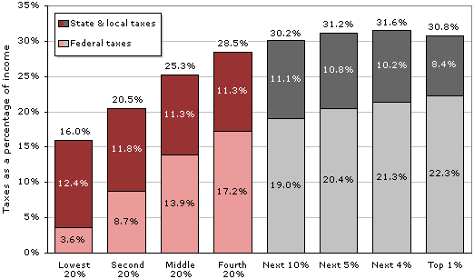
Source: Citizens for Tax Justice (2010a).
We also can look at this information on income and taxes in another way by asking what percentage of all taxes various income levels pay. (This is not the same as the previous question, which asked what percentage of their incomes went to taxes for people at various income levels.) And the answer to this new question can be found in Figure 7. For example, the top 20% receives 59.1% of all income and pays 64.3% of all the taxes, so they aren't carrying a huge extra burden. At the other end, the bottom 20%, which receives 3.5% of all income, pays 1.9% of all taxes.
Figure 7: Share of all income earned and all taxes paid, by quintile
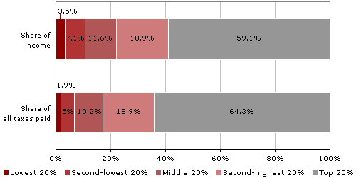
Source: Citizens for Tax Justice (2010a).
So the best estimates that can be put together from official government numbers show a little bit of progressivity. But the details on those who earn millions of dollars each year are very hard to come by, because they can stash a large part of their wealth in off-shore tax havens in the Caribbean and little countries in Europe, starting with Switzerland. And there are many loopholes and gimmicks they can use, as summarized with striking examples in Free Lunch and Perfectly Legal, the books by Johnston that were mentioned earlier. For example, Johnston explains the ways in which high earners can hide their money and delay on paying taxes, and then invest for a profit what normally would be paid in taxes.
Income inequality in other countries
The degree of income inequality in the United States can be compared to that in other countries on the basis of the Gini coefficient, a mathematical ratio that allows economists to put all countries on a scale with values that range (hypothetically) from zero (everyone in the country has the same income) to 100 (one person in the country has all the income). On this widely used measure, the United States ends up 95th out of the 134 countries that have been studied -- that is, only 39 of the 134 countries have worse income inequality. The U.S. has a Gini index of 45.0; Sweden is the lowest with 23.0, and South Africa is near the top with 65.0.
The table that follows displays the scores for 22 major countries, along with their ranking in the longer list of 134 countries that were studied (most of the other countries are very small and/or very poor). In examining this table, remember that it does not measure the same thing as Table 5 earlier in this document, which was about the wealth distribution. Here we are looking at the income distribution, so the two tables won't match up as far as rankings. That's because a country can have a highly concentrated wealth distribution and still have a more equal distribution of income due to high taxes on top income earners and/or high minimum wages -- both Switzerland and Sweden follow this pattern. So one thing that's distinctive about the U.S. compared to other industrialized democracies is that both its wealth and income distributions are highly concentrated.
Table 8: Income equality in selected countries
| Country/Overall Rank | Gini Coefficient |
|---|---|
| 1. Sweden | 23.0 |
| 2. Norway | 25.0 |
| 8. Austria | 26.0 |
| 10. Germany | 27.0 |
| 17. Denmark | 29.0 |
| 25. Australia | 30.5 |
| 34. Italy | 32.0 |
| 35. Canada | 32.1 |
| 37. France | 32.7 |
| 42. Switzerland | 33.7 |
| 43. United Kingdom | 34.0 |
| 45. Egypt | 34.4 |
| 56. India | 36.8 |
| 61. Japan | 38.1 |
| 68. Israel | 39.2 |
| 81. China | 41.5 |
| 82. Russia | 42.3 |
| 90. Iran | 44.5 |
| 93. United States | 45.0 |
| 107. Mexico | 48.2 |
| 125. Brazil | 56.7 |
| 133. South Africa | 65.0 |
Note: These figures reflect family/household income, not individual income.
Source: Central Intelligence Agency (2010).
The differences in income inequality between countries also can be illustrated by looking at the share of income earned by the now-familiar Top 1% versus the Bottom 99%. One of the most striking contrasts is between Sweden and the United States from 1950 to 2009, as seen in Figure 8; and note that the differences between the two countries narrowed in the 1950s and 1960s, but after that went their separate ways, in rather dramatic fashion.
Figure 8: Top income shares in the U.S. and Sweden, 1950-2009
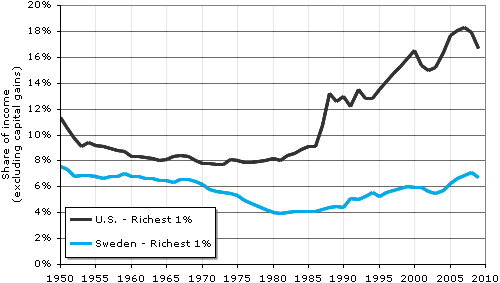
Source: Alvaredo et al. (2012), World Top Incomes Database.
The impact of "transfer payments"
As we've seen, taxes don't have much impact on the income distribution, especially when we look at the top 1% or top 0.1%. Nor do various kinds of tax breaks and loopholes have much impact on the income distribution overall. That's because the tax deductions that help those with lower incomes -- such as the Earned Income Tax Credit (EITC), tax forgiveness for low-income earners on Social Security, and tax deductions for dependent children -- are offset by the breaks for high-income earners (for example: dividends and capital gains are only taxed at a rate of 15%; there's no tax on the interest earned from state and municipal bonds; and 20% of the tax deductions taken for dependent children actually go to people earning over $100,000 a year).
But it is sometimes said that income inequality is reduced significantly by government programs that matter very much in the lives of low-income Americans. These programs provide "transfer payments," which are a form of income for those in need. They include unemployment compensation, cash payments to the elderly who don't have enough to live on from Social Security, Temporary Assistance to Needy Families (welfare), food stamps, and Medicaid.
Thomas Hungerford (2009), a tax expert who works for the federal government's Congressional Research Service, carried out a study for Congress that tells us about the real-world impact of transfer payments on reducing income inequality. Hungerford's study is based on 2004 income data from an ongoing study of a representative sample of families at the University of Michigan, and it includes the effects of both taxes and four types of transfer payments (Social Security, Temporary Assistance to Needy Families, food stamps, and Medicaid). The table that follows shows the income inequality index (that is, the Gini coefficient) at three points along the way: (1.) before taxes or transfers; (2) after taxes are taken into account; and (3) after both taxes and transfer payments are included in the equation. (The Citizens for Tax Justice study of income and taxes for 2009, discussed earlier, included transfer payments as income, so that study and Hungerford's have similar starting points. But they can't be directly compared, because they use different years.)
Table 9: Redistributive effect of taxes and transfer payments
| Income definition | Gini index |
|---|---|
| Before taxes and transfers | 0.5116 |
| After taxes, before transfers | 0.4774 |
| After taxes and transfers | 0.4284 |
Source: Congressional Research Service, adapted from Hungerford (2009).
As can be seen, Hungerford's findings first support what we had learned earlier from the Citizens for Tax Justice study: taxes don't do much to reduce inequality. They secondly reveal that transfer payments have a slightly larger impact on inequality than taxes, but not much. Third, his findings tell us that taxes and transfer payments together reduce the inequality index from .52 to .43, which is very close to the CIA's estimate of .45 for 2008.
In short, for those who ask if progressive taxes and transfer payments even things out to a significant degree, the answer is that while they have some effect, they don't do nearly as much as in Canada, major European countries, or Japan.
Income Ratios and Power: Executives vs. Average Workers
Another way that income can be used as a power indicator is by comparing average CEO annual pay to average factory worker pay, something that has been done for many years by Business Week and, later, the Associated Press. The ratio of CEO pay to factory worker pay rose from 42:1 in 1960 to as high as 531:1 in 2000, at the height of the stock market bubble, when CEOs were cashing in big stock options. It was at 411:1 in 2005 and 344:1 in 2007, according to research by United for a Fair Economy. By way of comparison, the same ratio is about 25:1 in Europe. The changes in the American ratio from 1960 to 2007 are displayed in Figure 9, which is based on data from several hundred of the largest corporations.
Figure 9: CEOs' pay as a multiple of the average worker's pay, 1960-2007
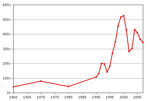
Source: Executive Excess 2008, the 15th Annual CEO Compensation Survey from the Institute for Policy Studies and United for a Fair Economy.
It's even more revealing to compare the actual rates of increase of the salaries of CEOs and ordinary workers; from 1990 to 2005, CEOs' pay increased almost 300% (adjusted for inflation), while production workers gained a scant 4.3%. The purchasing power of the federal minimum wage actually declined by 9.3%, when inflation is taken into account. These startling results are illustrated in Figure 10.
Figure 10: CEOs' average pay, production workers' average pay, the S&P 500 Index , corporate profits , and the federal minimum wage, 1990-2005 (all figures adjusted for inflation)
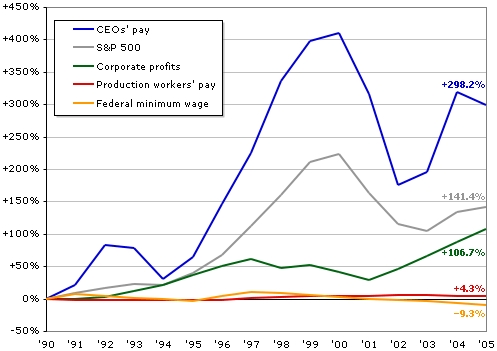
Source: Executive Excess 2006, the 13th Annual CEO Compensation Survey from the Institute for Policy Studies and United for a Fair Economy.
Although some of the information I've relied upon to create this section on executives' vs. workers' pay is a few years old now, the AFL/CIO provides up-to-date information on CEO salaries at their Web site. There, you can learn that the median compensation for CEO's in all industries as of early 2010 is $3.9 million; it's $10.6 million for the companies listed in Standard and Poor's 500, and $19.8 million for the companies listed in the Dow-Jones Industrial Average. Since the median worker's pay is about $36,000, then you can quickly calculate that CEOs in general make 100 times as much as the workers, that CEO's of S&P 500 firms make almost 300 times as much, and that CEOs at the Dow-Jones companies make 550 times as much. (For a more recent update on CEOs' pay, see "The Drought Is Over (At Least for CEOs)" at NYTimes.com; the article reports that the median compensation for CEOs at 200 major companies was $9.6 million in 2010 -- up by about 12% over 2009 and generally equal to or surpassing pre-recession levels. For specific information about some of the top CEOs, see http://projects.nytimes.com
If you wonder how such a large gap could develop, the proximate, or most immediate, factor involves the way in which CEOs now are able to rig things so that the board of directors, which they help select -- and which includes some fellow CEOs on whose boards they sit -- gives them the pay they want. The trick is in hiring outside experts, called "compensation consultants," who give the process a thin veneer of economic respectability.
The process has been explained in detail by a retired CEO of DuPont, Edgar S. Woolard, Jr., who is now chair of the New York Stock Exchange's executive compensation committee. His experience suggests that he knows whereof he speaks, and he speaks because he's concerned that corporate leaders are losing respect in the public mind. He says that the business page chatter about CEO salaries being set by the competition for their services in the executive labor market is "bull." As to the claim that CEOs deserve ever higher salaries because they "create wealth," he describes that rationale as a "joke," says the New York Times (Morgenson, 2005).
Here's how it works, according to Woolard:
The compensation committee [of the board of directors] talks to an outside consultant who has surveys you could drive a truck through and pay anything you want to pay, to be perfectly honest. The outside consultant talks to the human resources vice president, who talks to the CEO. The CEO says what he'd like to receive. It gets to the human resources person who tells the outside consultant. And it pretty well works out that the CEO gets what he's implied he thinks he deserves, so he will be respected by his peers. (Morgenson, 2005.)
The board of directors buys into what the CEO asks for because the outside consultant is an "expert" on such matters. Furthermore, handing out only modest salary increases might give the wrong impression about how highly the board values the CEO. And if someone on the board should object, there are the three or four CEOs from other companies who will make sure it happens. It is a process with a built-in escalator.
As for why the consultants go along with this scam, they know which side their bread is buttered on. They realize the CEO has a big say-so on whether or not they are hired again. So they suggest a package of salaries, stock options and other goodies that they think will please the CEO, and they, too, get rich in the process. And certainly the top executives just below the CEO don't mind hearing about the boss's raise. They know it will mean pay increases for them, too. (For an excellent detailed article on the main consulting firm that helps CEOs and other corporate executives raise their pay, check out the New York Times article entitled "America's Corporate Pay Pal", which supports everything Woolard of DuPont claims and adds new information.)
If hiring a consulting firm doesn't do the trick as far as raising CEO pay, then it may be possible for the CEO to have the board change the way in which the success of the company is determined. For example, Walmart Stores, Inc. used to link the CEO's salary to sales figures at established stores. But when declining sales no longer led to big pay raises, the board simply changed the magic formula to use total companywide sales instead. By that measure, the CEO could still receive a pay hike (Morgenson, 2011).
There's a much deeper power story that underlies the self-dealing and mutual back-scratching by CEOs now carried out through interlocking directorates and seemingly independent outside consultants. It probably involves several factors. At the least, on the workers' side, it reflects their loss of power following the all-out attack on unions in the 1960s and 1970s, which is explained in detail in an excellent book by James Gross (1995), a labor and industrial relations professor at Cornell. That decline in union power made possible and was increased by both outsourcing at home and the movement of production to developing countries, which were facilitated by the break-up of the New Deal coalition and the rise of the New Right (Domhoff, 1990, Chapter 10). It signals the shift of the United States from a high-wage to a low-wage economy, with professionals protected by the fact that foreign-trained doctors and lawyers aren't allowed to compete with their American counterparts in the direct way that low-wage foreign-born workers are.
(You also can read a quick version of my explanation for the "right turn" that led to changes in the wealth and income distributions in an article on this site, where it is presented in the context of criticizing the explanations put forward by other theorists.)
On the other side of the class divide, the rise in CEO pay may reflect the increasing power of chief executives as compared to major owners and stockholders in general, not just their increasing power over workers. CEOs may now be the center of gravity in the corporate community and the power elite, displacing the leaders in wealthy owning families (e.g., the second and third generations of the Walton family, the owners of Walmart). True enough, the CEOs are sometimes ousted by their generally go-along boards of directors, but they are able to make hay and throw their weight around during the time they are king of the mountain.
The claims made in the previous paragraph need much further investigation. But they demonstrate the ideas and research directions that are suggested by looking at the wealth and income distributions as indicators of power.
Further Information
- You can download a PDF of the complete 2012 paper by Edward Wolff at http://appam.confex.com/
data/ extendedabstract/ appam/ 2012/ Paper_2134_extendedabstract_151_0.pdf. - The Census Bureau report is on line at http://www.census.gov/hhes/www/wealth/wealth.html
- The World Institute for Development Economics Research (UNU-WIDER) report on household wealth throughout the world is available at http://tinyurl.com/wdhw08; see the WIDER site for more about their research.
- For good summaries of other information on wealth and income, and for information on the estate tax, see the United For A Fair Economy site at http://www.faireconomy.org/. Their research on CEO pay can be found here: http://www.faireconomy.org/issues/ceo_pay
- For some recent data on taxes from a variety of angles -- presented in a number of colorful charts and graphs -- the Center on Budget and Policy Priorities created a page entitled "Top Ten Tax Charts" in April 2011.
- The New York Times ran an excellent series of articles on executive compensation in the fall of 2006 entitled "Gilded Paychecks." Look for it by searching the archives on NYTimes.com.
- For a brief 2010 account by tax expert David Cay Johnston on how the owners of oil pipelines have avoided taxes for the past 25 years simply by converting from the corporate form of ownership to partnerships, check out his brief video on YouTube. For the full details, see his column on taxanalysts.com.
- To see a video of Ed Woolard giving his full speech about executive compensation, go to http://www.compensationstandards.com/nonmember/EdWoolard_video.asp(WMV file, may not be viewable on all platforms/browsers)
- The Shapiro & Friedman paper on capital income, along with many other reports on the federal budget and its consequences, are available at the Center on Budget and Policy Priorities site: http://www.cbpp.org/pubs/recent.html
- The AFL-CIO maintains a site called "Executive Paywatch," which summarizes information about the salary disparity between executives and other workers: http://www.aflcio.org/corporatewatch/paywatch/.
- Emmanuel Saez, Professor of Economics at UC Berkeley, has written or co-authored a number of papers on income inequality and related topics: http://elsa.berkeley.edu/~saez/
- An update on the lack of wage growth in the 2007-2010 recession ("Recession hits workers' paychecks") can be found at the Web site of the Economic Policy Institute.
References
AFL-CIO (2010). Executive PayWatch: CEO Pay Database: Compensation by Industry. Retrieved February 8, 2010 from http://www.aflcio.org/
Alvaredo, F., Atkinson, T., Piketty, T., & Saez, E. (2012). World Top Incomes Database.Retrieved March 14, 2012 from http://g-mond.parisschoolofeconomics.eu/
Anderson, S., Cavanagh, J., Collins, C., Lapham, M., & Pizzigati, S. (2008). Executive Excess 2008: How Average Taxpayers Subsidize Runaway Pay. Washington, DC: Institute for Policy Studies / United for a Fair Economy.
Anderson, S., Cavanagh, J., Collins, C., Lapham, M., & Pizzigati, S. (2007). Executive Excess 2007: The Staggering Social Cost of U.S. Business Leadership. Washington, DC: Institute for Policy Studies / United for a Fair Economy.
Anderson, S., Benjamin, E., Cavanagh, J., & Collins, C. (2006). Executive Excess 2006: Defense and Oil Executives Cash in on Conflict. Washington, DC: Institute for Policy Studies / United for a Fair Economy.
Anderson, S., Cavanagh, J., Klinger, S., & Stanton, L. (2005). Executive Excess 2005: Defense Contractors Get More Bucks for the Bang. Washington, DC: Institute for Policy Studies / United for a Fair Economy.
Center for Economic and Policy Research (2011). New Census Numbers Make it Official: 2000-2010 Was a Lost Economic Decade. Retrieved October 25, 2011 from http://www.cepr.net/data-bytes/poverty-bytes/
Central Intelligence Agency (2010). World Factbook: Country Comparison: Distribution of family income - Gini index. Retrieved October 26, 2010 from https://www.cia.gov/library/publications/the-world-factbook/rankorder/2172rank.html.
Citizens for Tax Justice (2010b). State-by-State Estate Tax Figures: Number of Deaths Resulting in Estate Tax Liability Continues to Drop. Retrieved December 13, 2010 from http://www.ctj.org/pdf/estatetax2010.pdf.
Citizens for Tax Justice (2010a). All Americans Pay Taxes. Retrieved April 15, 2010 from http://www.ctj.org/pdf/taxday2010.pdf.
Dahl, R. A. (1957). The concept of power. Behavioral Science, 2, 202-210.
Dahl, R. A. (1958). A critique of the ruling elite model. American Political Science Review, 52, 463-469.
Davies, J. B., Sandstrom, S., Shorrocks, A., & Wolff, E. N. (2006). The World Distribution of Household Wealth. Helsinki: World Institute for Development Economics Research.
Domhoff, G. W. (1990). The Power Elite and the State: How Policy Is Made in America. Hawthorne, NY: Aldine de Gruyter.
Gross, J. A. (1995). Broken Promise: The Subversion of U.S. Labor Relations Policy. Philadelphia: Temple University Press.
Hungerford, T. (2009). Redistribution effects of federal taxes and selected tax provisions.Washington: Congressional Research Service.
Johnston, D. C. (2011). Beyond the 1 percent. Retrieved November 7, 2011 from http://blogs.reuters.com/
Johnston, D. C. (2010b). United in Our Delusion. Retrieved October 12, 2010 from http://www.taxanalysts.com/
Johnston, D. C. (2010a). Tax Rates for Top 400 Earners Fall as Income Soars, IRS Data.Retrieved February 23, 2010 from http://www.taxanalysts.com/
Johnston, D. C. (2009, December 21). Is Our Tax System Helping Us Create Wealth?Tax Notes , pp. 1375-1377.
Johnston, D. C. (2006, November 28). '04 Income in U.S. Was Below 2000 Level. New York Times, p. C-1.
Keister, L. (2005). Getting Rich: A Study of Wealth Mobility in America. New York: Cambridge University Press.
Kenny, C., Lincoln, T., Collins, C., & Farris, L. (2006). Spending Millions to Save Billions: The Campaign of the Super Wealthy to Kill the Estate Tax. Washington, DC: Public Citizen / United for a Fair Economy.
Kotlikoff, L., & Gokhale, J. (2000). The Baby Boomers' Mega-Inheritance: Myth or Reality?Cleveland: Federal Reserve Bank of Cleveland.
Lukes, S. (2005). Power: A Radical View (Second ed.). New York: Palgrave.
Madoff, R. D. (2010, July 12). America Builds an Aristocracy. New York Times, p. A-19.
Morgenson, G. (2011, May 8). Moving the goal posts on pay. New York Times, Section BU, p. 1.
Morgenson, G. (2005, October 23). How to slow runaway executive pay. New York Times, Section 3, p. 1.
Norris, F. (2010, July 24). Off the Charts: In '08 Downturn, Some Managed to Eke Out Millions. New York Times, p. B-3.
Norton, M. I., & Ariely, D. (2010, forthcoming). Building a better America - one wealth quintile at a time. Perspectives on Psychological Science.
Polsby, N. (1980). Community Power and Political Theory (Second ed.). New Haven, CT: Yale University Press.
Russell, B. (1938). Power: A New Social Analysis. London: Allen and Unwin.
Saez, E. (2009). Striking It Richer: The Evolution of Top Incomes in the United States (Update with 2007 Estimates). Retrieved August 28, 2009 from http://elsa.berkeley.edu/
Saez, E., & Piketty, T. (2003). Income Inequality in the United States, 1913-1998. Quarterly Journal of Economics, 118, 1-39.
Shapiro, I., & Friedman, J. (2006). New, Unnoticed CBO Data Show Capital Income Has Become Much More Concentrated at the Top. Washington, DC: Center on Budget and Policy Priorities.
Stephens, J. (1979). The Transition from Capitalism to Socialism. London: Macmillan.
Wolff, E. N. (1996). Top Heavy. New York: The New Press.
Wolff, E. N. (2004). Changes in household wealth in the 1980s and 1990s in the U.S. Working Paper No. 407. Annandale-on-Hudson, NY: The Levy Economics Institute of Bard College.
Wolff, E. N. (2007). Recent trends in household wealth in the United States: Rising debt and the middle-class squeeze. Working Paper No. 502. Annandale-on-Hudson, NY: The Levy Economics Institute of Bard College.
Wolff, E. N. (2010). Recent trends in household wealth in the United States: Rising debt and the middle-class squeeze - an update to 2007. Working Paper No. 589. Annandale-on-Hudson, NY: The Levy Economics Institute of Bard College.
Wolff, E. N. (2012). The Asset Price Meltdown and the Wealth of the Middle Class. New York: New York University.
Wolff, E. N. (2014). Household Wealth Trends in the United States, 1962-2013: What Happened Over the Great Recession?. Cambridge, MA: National Bureau of Economic Research.
Wolff, E. N. (2017, forthcoming). A Century of Wealth in America. Cambridge, MA: Harvard University Press.
Wrong, D. (1995). Power: Its Forms, Bases, and Uses (Second ed.). New Brunswick: Transaction Publishers.
Subscribe to:
Posts (Atom)
-
 http://fwd4.me/gjF CLEAR MESSAGE: Protestors walk past a billboard which reads: 'No to austerity' during a demonstration in Bru...
 -
La Administración Biden ha habilitado una nueva "Iniciativa contra el terrorismo doméstico" para defender "The Homeland"...
-
Jillian Kestler-D'Amours More than 70 percent of the guests had their visa applications denied [Marc Braibant/AFP] T...
